Why Website Links Confuse Readers (And How to Fix Them)
A link can work perfectly and still do a terrible job. It opens the right page, loads without errors, and sends visitors exactly where it should. Technically, everything checks out. But if people have to guess what happens after they click, your website has a communication problem.
- The Problem With Links That Say Almost Nothing
- What Readers Need to Know Before They Click
- A Small Rewrite Can Change the Entire Experience
- Where Short URLs Help—and Where They Don't
- Read Your Page Like Someone Who Has Never Seen It Before
- Make Every Link Earn Its Place
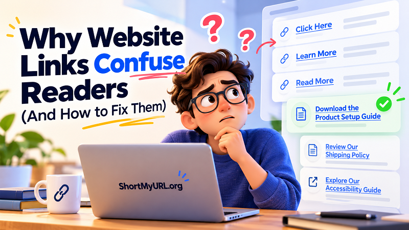
Think about the last time you landed on a page filled with “Click Here,” “Learn More,” and “Read More” links. Which one had the information you needed? If the answer wasn't obvious, you had to slow down, read more carefully, or click around until you found the right destination. That's unnecessary friction—and your visitors shouldn't have to solve a puzzle just to navigate your website.
The Problem With Links That Say Almost Nothing
Generic link text isn't automatically wrong. A single “Learn More” button next to a clearly described product might work just fine. The trouble starts when the same vague labels appear repeatedly, especially when several links lead to completely different destinations.
Imagine a software company publishing a resource page with three links labeled “Read More.” One leads to a pricing guide, another explains data security, and the third covers account setup. A visitor scanning the page can't immediately tell which link answers their question. They must inspect the surrounding text or click each option to find out.
That extra effort might seem insignificant, but websites compete for attention in an environment where people skim first and investigate later. Every unnecessary decision makes the experience a little more frustrating.
There's another issue: people don't interact with websites in exactly the same way. Some scan headings and links before reading the full page. Others use screen readers, which may let them navigate through links independently of the surrounding paragraphs. When every link sounds identical, that navigation becomes much less useful.
The takeaway is simple: a link shouldn't merely tell people that they can click. It should help them understand why they might want to.
What Readers Need to Know Before They Click
Good link text answers an important question before the click happens: What will I find on the other side?
The answer doesn't need to be long. It needs to be specific enough to set an accurate expectation. Compare “Click Here” with “Download the Product Setup Guide.” The second version tells visitors what they'll receive and what action they can expect to take. There's no guessing involved.
The same principle applies to editorial content, support pages, and business websites. “Read More” might become “Explore Our Return Policy.” “View Details” could become “Compare Available Subscription Plans.” These small changes make a page easier to scan without turning every link into a miniature paragraph.
Context still matters. A short link label can be perfectly understandable when the surrounding sentence clearly identifies its purpose. However, the label should remain meaningful when someone encounters it outside that immediate context whenever practical. This is especially valuable for people navigating through a list of links with assistive technology.
There's no need to stuff keywords into every clickable phrase, either. Search engines aren't the only audience reading your links. Write for actual humans first, describe the destination honestly, and let relevant terminology appear naturally.
A Small Rewrite Can Change the Entire Experience
Consider a few everyday situations where the original link technically works but doesn't communicate enough.
Scenario 1: A customer needs help with a product.
Before: “Click here for instructions.”
After: “Read the Product Installation Guide.”
The improved version identifies the resource immediately. A visitor who needs installation instructions can recognize the right destination without rereading the entire paragraph.
Scenario 2: An online store explains its policies.
Before: “Learn more about our policies.”
After: “Review Our Shipping and Return Policies.”
The revised wording sets a clearer expectation. Visitors know they're heading toward information about delivery and returns rather than a general company overview.
Scenario 3: A blog references an external resource.
Before: “Check this out.”
After: “Read the Official Website Accessibility Guidelines.”
The second option explains the value of the destination and gives readers a better idea of what they're about to open.
Notice what these examples have in common: none requires a redesign, a new plugin, or a complicated SEO strategy. They require a little more thought about the reader's next move.
Of course, specificity shouldn't come at the expense of accuracy. Don't label a link “Download the Free Guide” if it leads to a sales page, and don't promise a detailed tutorial when the destination contains only a brief overview. Clear wording creates expectations; the destination must fulfill them.
Where Short URLs Help—and Where They Don't
Long URLs can make an otherwise clean page feel cluttered, especially when they're pasted into emails, printed materials, presentations, or social media posts. A long address with multiple parameters may also look intimidating when someone needs to type it manually.
In these situations, a url shortener can turn a lengthy address into a more compact link that's easier to share and manage. A shorter URL can improve the visual presentation of a message and leave more room for the information surrounding it.
But here's the distinction worth remembering: a shorter URL isn't automatically a clearer link.
If your clickable text says “Click Here,” shortening the destination address doesn't solve the underlying communication problem. Likewise, replacing a descriptive link with a mysterious string of characters won't necessarily make people more confident about clicking it.
The strongest combination is a concise destination URL when appropriate and descriptive link text that explains where the link leads. If you use shortened links, make sure the destination is trustworthy, the redirect works correctly, and the surrounding copy gives readers a legitimate reason to click.
In other words, use link shortening to simplify the address—not to replace good communication.
Read Your Page Like Someone Who Has Never Seen It Before
Writers and website owners have an advantage that can become a blind spot: they already know what every link means. Visitors don't have that background knowledge. A label that feels obvious to the person who wrote the page may be completely unhelpful to someone arriving for the first time.
Try looking at your website from a fresh perspective. Instead of reading every paragraph, scan the page for clickable text. Could you identify the destination of each link without carefully studying the surrounding content? If several links have identical labels, would you know which one to choose?
Next, check whether the wording matches the actual destination. A link promising a downloadable document should lead to that document or a clearly explained download page. A link describing a particular service should take visitors to information about that service, not a generic homepage.
Finally, pay attention to repeated patterns. If every section ends with “Learn More,” consider whether those links can describe their destinations more precisely. You don't have to eliminate familiar phrases entirely; just avoid relying on them when they leave important information unstated.
This isn't about making every link longer. Sometimes one or two well-chosen words are enough. The goal is to remove ambiguity, not add unnecessary text.
Make Every Link Earn Its Place
A useful website doesn't make visitors work harder than necessary. Every navigation choice should help them move toward an answer, a resource, or an action they actually want to complete.
Clear link text improves more than convenience. It supports accessible navigation, makes content easier to scan, and helps people form accurate expectations before they click. These improvements don't require a complete website overhaul. Start with the links that cause the most confusion, replace vague labels with meaningful descriptions, and make sure each destination delivers what its wording promises.
And remember: the best link isn't necessarily the shortest one or the cleverest one. It's the one that helps the right person recognize the right destination at the right moment.
Take a look at your website's links today. If visitors have to guess where a link leads, give them a better reason to click.