Why Event Registration Links Lose Sign-Ups Before Registration
You've planned the event, designed an eye-catching poster, written persuasive promotional copy, and shared everything across social media. People are reacting. They're commenting, sharing, and showing interest. Yet when you check the registration dashboard, something feels off: the number of actual sign-ups doesn't match the attention your campaign is receiving.
- Your Event Promotion Is Working, but Where Are the Registrations?
- The Registration Journey Has More Friction Than You Think
- Five Small Link Problems That Can Cost You Attendees
- 1. The Link Leads to the Wrong Destination
- 2. The URL Looks Like a Digital Mess
- 3. The Registration Link Is Difficult to Find
- 4. The Registration Page Requires Unexpected Permissions
- 5. Different Promotional Materials Contain Different Links
- One Event, Multiple Channels, One Clear Registration Destination
- Stop Measuring Attention When You Need to Measure Registrations
- Design the Registration Experience Around the Attendee
- Final Thoughts: Every Click Should Bring Someone Closer to Your Event
Sound familiar?
It's tempting to blame the event topic, ticket price, timing, or advertising strategy. But there's another part of the experience that often gets overlooked: the journey between seeing an event promotion and reaching the registration page. And sometimes, that journey starts with something as small as a link.
A registration link might look like a minor detail in your marketing campaign. To a potential attendee, however, it's the doorway to your event. If that doorway is confusing, inconvenient, or simply doesn't lead where expected, some people will walk away before they even get inside.
Your Event Promotion Is Working, but Where Are the Registrations?
Imagine someone scrolling through Instagram during a lunch break. They see your event poster, like the topic, and decide they might attend. They're interested enough to take action, but not interested enough to spend five minutes hunting for the registration page.
They look for the link. Perhaps it's buried in a caption, hidden behind several profile clicks, or displayed as a long, complicated URL. Maybe they tap it and land on a general website instead of the actual sign-up form.
That tiny interruption creates a decision point. The person has to figure out what to do next, and every extra step gives them another opportunity to abandon the process.
This is where marketing teams can misunderstand their numbers. A campaign may generate plenty of attention without creating an equally strong registration experience. Getting someone interested is one achievement. Making it effortless for them to act on that interest is another.
The real question isn't simply how many people saw your event. It's how many could move from curiosity to registration without unnecessary friction.
The Registration Journey Has More Friction Than You Think
Event registration rarely happens in one perfectly controlled environment. Someone might discover your event through Facebook, revisit the information through an email, and finally register after receiving a reminder in a messaging app.
Each interaction happens in a different context. The person could be using a phone, switching between applications, or trying to register while doing something else.
Think about the journey from the attendee's perspective. They see the promotion, recognize the value, locate the registration link, open the destination, understand what is required, and complete the form. That's a sequence of small actions, not one single click.
If the link sends them somewhere unexpected, the experience becomes confusing. If the destination takes too long to load, patience starts running out. If the page requires an account they don't have, the original excitement can disappear surprisingly quickly.
The lesson is simple: your registration funnel doesn't begin when someone opens the form. It begins much earlier, at the moment they decide to follow your invitation.
Five Small Link Problems That Can Cost You Attendees
Not every abandoned registration is caused by a bad link. But certain problems create avoidable obstacles that event organizers should take seriously.
1. The Link Leads to the Wrong Destination
This sounds obvious, but it happens more often than you'd expect. An organizer may accidentally share an event homepage, an outdated registration form, or even an internal management link.
The attendee expects a sign-up page but finds something completely different. Now they have to search again, contact the organizer, or give up.
Before distributing promotional materials, verify that every link leads to the exact destination attendees are supposed to reach.
2. The URL Looks Like a Digital Mess
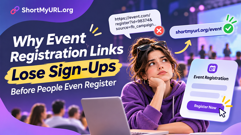
Some registration platforms generate long URLs filled with tracking parameters, session identifiers, and random-looking characters. These links may work perfectly, but they aren't particularly attractive when printed on posters, included in promotional graphics, or shared in short messages.
A complicated-looking URL can also make people hesitant to click, especially when they don't recognize the destination.
You don't need to make every link visually fancy. You need to make it easy to recognize, communicate, and use.
3. The Registration Link Is Difficult to Find
Your promotional content might be excellent, but where exactly should people click?
If the call to action says "Register Now" while the actual link is buried halfway through a long caption, the experience becomes unnecessarily frustrating. The same problem occurs when an event poster tells people to visit a website without clearly identifying the registration destination.
Make the next action obvious. People shouldn't have to solve a puzzle to attend your event.
4. The Registration Page Requires Unexpected Permissions
Imagine clicking an event invitation only to see a message saying you need permission to access the document.
For organizers using online forms or shared documents, this is a particularly embarrassing problem. The link may be correct, but the access settings aren't.
Test the registration experience using an account that isn't connected to your organization. This helps reveal permission issues before real attendees encounter them.
5. Different Promotional Materials Contain Different Links
Your Facebook post points to one form, your email newsletter contains another, and the printed poster uses an older URL.
Now your marketing team has multiple destinations floating around. Some may be outdated, while others may still work but collect registrations in separate places.
A consistent destination makes the campaign easier to manage and reduces the possibility of sending attendees down the wrong path.
One Event, Multiple Channels, One Clear Registration Destination
An event campaign rarely depends on a single promotional channel. You might use Facebook posts, Instagram Stories, email newsletters, printed flyers, QR codes, partner websites, and direct messages.
The challenge is keeping the attendee experience consistent across all of them.
A practical approach is to establish one official registration destination and distribute a recognizable link wherever your audience encounters the event. That doesn't mean every channel needs identical promotional content. It means every call to action should lead people toward the correct registration experience.
This is where a short url can become useful. Instead of displaying a long, complicated registration address, organizers can share a cleaner link that's easier to include in captions, promotional graphics, emails, and printed materials.
For campaigns that use QR codes, the same destination can also be encoded into a scannable code. Someone attending a conference, walking past a poster, or looking at a printed invitation can move directly toward the registration page without manually typing a lengthy address.
The important distinction is that a shorter link doesn't automatically improve conversion rates. It simply makes the destination easier to communicate and manage. The registration page itself still needs to deliver a smooth experience.
Stop Measuring Attention When You Need to Measure Registrations
One of the biggest mistakes in event marketing is treating clicks as proof that a campaign is successful.
A post receives 5,000 views and 300 link clicks. That sounds promising. But how many people actually completed the registration form?
Those numbers tell different stories.
Views indicate exposure. Clicks indicate that someone took an initial action. Completed registrations indicate that the person made it through the process.
For a more useful picture of campaign performance, track the journey beyond the first interaction. Compare traffic sources, registration page visits, completed submissions, and attendance whenever those metrics are available.
For example, if Facebook generates substantial traffic but relatively few completed registrations, investigate the experience after the click. Perhaps the audience isn't a good fit, the registration page is confusing, or the event information doesn't match the promise made in the advertisement.
If email generates fewer clicks but a higher percentage of completed registrations, that channel may be attracting people with stronger intent.
Don't celebrate a high click count while ignoring what happens next. The goal isn't to collect clicks. It's to get the right people through the registration process.
Design the Registration Experience Around the Attendee
Event organizers often focus heavily on what they need: collecting attendee information, organizing guest lists, managing ticket categories, and preparing event logistics.
All of that matters. But the attendee doesn't care how complicated your internal process is. They want to understand the event, decide whether it's worth attending, and register without unnecessary hassle.
That means the registration experience should be designed around the person using it.
Start by making event details easy to understand. Clearly communicate the date, location, schedule, participation requirements, and any applicable fees. Place the registration call to action somewhere people can find it immediately.
Then consider the device they're using. A registration page that looks excellent on a desktop but becomes difficult to navigate on a smartphone can create problems for a large portion of your audience.
Keep forms focused. Ask for information that genuinely helps organize the event, rather than turning registration into an exhausting questionnaire. Explain what happens after submission so attendees know whether their registration was successful.
Finally, test the entire experience yourself. Don't stop after confirming that the link opens. Follow the same steps a first-time attendee would take, from discovering the invitation to receiving the registration confirmation.
Final Thoughts: Every Click Should Bring Someone Closer to Your Event
A successful event campaign isn't built entirely on impressive posters, clever captions, or a large advertising budget. It's also built on the small interactions that connect your promotion to the actual experience.
A confusing destination, an inaccessible form, or an inconsistent registration link might seem insignificant on its own. But when potential attendees encounter unnecessary friction, even a strong event promotion can lose momentum.
Think of your registration journey as part of the event itself. Make the invitation clear, the destination reliable, and the next action obvious. Give people a reason to attend, then make it easy for them to say yes.
Because the best registration experience is the one that lets people spend less time figuring out where to click and more time looking forward to the event.