The Hidden Problem With Sharing Links Everywhere
A link can be perfectly functional and still be a terrible thing to share.
- A Link Is More Than Its Destination
- The Browser Is Probably the Easiest Place to Share a Link
- Email Changes the Equation
- Social Media Has Its Own Rules
- Messaging Is About Speed
- Then Someone Prints the Link
- The Same Campaign Can Need Several Link Formats
- Don't Forget the Human Part
- Shorter Isn't Always Better
- Think About the Journey, Not Just the URL
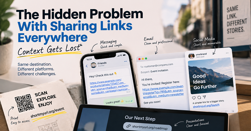
That sounds a little dramatic, but think about how often you move the same URL from one place to another. You copy a product page from your browser and send it to a friend. You paste a registration link into an email. You put a campaign URL into a presentation. Later, that same destination ends up on a poster, a social media post, or a QR code. The page hasn't changed. The destination hasn't changed. But the experience of sharing it can be completely different.
That's the part people tend to overlook. We often treat a URL as if it were just an address that either works or doesn't. In reality, a link also has to fit the environment where it appears. What looks perfectly normal in a browser can look messy in an email. What works in a chat message may be ridiculous on a printed flyer. And a URL that's easy to copy on a desktop can become a chore when someone has to type it from a piece of paper.
The destination stays the same. The context changes.
A Link Is More Than Its Destination
When you click a link on a website, you usually don't think about the URL itself. You see a button, a product name, an article title, or some other piece of descriptive text. The URL is quietly doing its job in the background.
Sharing is different because the address itself often becomes part of the communication.
Imagine sending someone a message that says, “Here's the registration page,” followed by a URL stretching across several lines. The recipient isn't just looking at a destination anymore. They're looking at a piece of information that has to be copied, recognized, interpreted, and sometimes remembered.
This is where context starts to matter.
A URL doesn't exist in isolation. It lives inside an email, a conversation, a presentation, a social post, a document, a poster, or some other medium. Each environment has its own limitations, and a link that ignores those limitations can make the whole message harder to use.
The Browser Is Probably the Easiest Place to Share a Link
Ironically, the place where most people create URLs is also one of the places where URL length matters the least.
You're sitting on a website, you copy the address from the browser, and you're done. Nobody has to type it manually. Nobody cares whether it contains five folders or a dozen tracking parameters. If you're using a normal clickable hyperlink, the actual length of the URL may be completely invisible to the person reading the page.
This creates a false sense that the URL will work equally well everywhere else.
It won't.
The moment you take that same address out of the browser and start moving it between platforms, its weaknesses become more obvious.
Email Changes the Equation
Email is one of those places where a link can suddenly become part of the visual design.
A long URL pasted directly into an email can interrupt an otherwise clean message. It may wrap onto several lines, look intimidating, or draw more attention than the sentence explaining why the recipient should click it.
There is also a difference between sending a link to a friend and sending one to a customer. In a casual conversation, nobody is particularly worried about visual polish. In a customer-facing email, newsletter, invitation, or business communication, the little details start to matter.
This doesn't mean every email needs a shortened URL. If you're using descriptive anchor text such as “View the event details,” the actual address can remain hidden behind the text. But when the URL itself needs to be visible or copied, keeping it concise can make the message considerably easier to work with.
Social Media Has Its Own Rules
Social platforms have changed the way people interact with links. Some generate automatic previews. Some restrict where clickable links can appear. Some display only part of an address. Others encourage users to put a single destination in a profile rather than attaching a link to every post.
That means the traditional idea of “just paste the URL” doesn't always make sense anymore.
A link used in a social campaign may need to be memorable enough for someone to recognize later. A creator sharing a resource might want something easy to mention verbally. A business running several promotions may need different links so each campaign can be managed independently.
The important point is that the best link isn't necessarily the shortest one. It's the one that makes sense within the way people encounter it.
That's a subtle difference, but it changes how you should think about link sharing.
Messaging Is About Speed
Chat apps have a completely different rhythm.
People aren't carefully formatting messages. They're copying something, pasting it, sending it, and moving on. A huge URL can make an otherwise simple message look unnecessarily complicated.
There's also the practical issue of copying. If a URL contains a long series of parameters, it becomes harder to visually verify whether you've copied the entire address correctly. On a phone, where the screen is smaller and people are already dealing with a keyboard designed for thumbs rather than precision, this becomes even more noticeable.
A concise link doesn't magically make every conversation better, but it removes one small piece of friction. And when you're sharing links dozens of times a day, small pieces of friction add up.
Then Someone Prints the Link
This is where the difference between digital and physical communication becomes almost comical.
A URL designed for a browser can be perfectly reasonable on a screen and completely impractical on paper.
Put a complicated web address on a restaurant menu, event poster, business card, product package, or flyer, and you've effectively asked someone to manually reproduce a string of characters. One typo can break the journey.
This is one reason short links and QR codes work so naturally together. The QR code handles the physical-to-digital transition, while a short URL can provide a human-readable alternative when someone can't or doesn't want to scan.
For example, someone might see a QR code on a poster and scan it immediately. Someone else might prefer to type the short address into their phone. Both people can reach the same destination without forcing either one to deal with an unnecessarily complicated URL.
The Same Campaign Can Need Several Link Formats
Here's another interesting consequence: you don't always have to choose one universal way to share a destination.
Imagine you're promoting an online event.
On your website, the full URL might be perfectly acceptable. In an email, you could use descriptive anchor text. On social media, a short link might be easier to share. On a printed poster, the QR code could be the primary option, with a short URL underneath as a fallback.
They're all pointing to the same place.
This is where a link shortener becomes useful—not because long URLs are inherently wrong, but because a shorter address gives you another format that can adapt to situations where the original URL isn't particularly convenient.
That's a much more practical way to think about link shortening. You're not trying to replace the original URL everywhere. You're creating a version that's easier to use in the places where the original becomes awkward.
Don't Forget the Human Part
There is a tendency to approach links entirely from a technical perspective. Does the URL resolve? Does the redirect work? Does the tracking parameter register? Is the server responding?
All of those questions matter.
But there's another question worth asking: Can a normal person understand what they're being asked to do?
A technically perfect link can still create a poor experience if the surrounding message is confusing. A beautifully shortened URL can still feel suspicious if it arrives without context. A QR code can be technically flawless and still fail if nobody knows what will happen after scanning it.
The link is only one part of the journey.
Good sharing gives people enough information to understand where they're going and why they should go there. The URL then becomes a tool that supports that decision rather than something they have to decode themselves.
Shorter Isn't Always Better
This is probably the most important takeaway.
There's no prize for having the shortest URL on the internet.
If a normal URL is already readable, recognizable, and easy to share, there's nothing wrong with leaving it exactly as it is. Shortening becomes useful when it solves a real problem: too much visual clutter, difficult copying, limited space, printed material, campaign organization, or a need for a more manageable link.
And sometimes the best solution isn't shortening at all. A descriptive hyperlink might be better in an article. A QR code might make more sense on a poster. A branded landing page might be more useful for a campaign.
The right format depends on where the link is going to live.
Think About the Journey, Not Just the URL
A good link doesn't exist simply to take someone from point A to point B. It sits inside a journey: someone sees a message, understands what it means, decides whether to continue, interacts with the link, and finally reaches the destination.
Every step can introduce friction.
That's why it's worth looking at links from the user's perspective rather than treating them as strings of characters. Ask where the link will appear, who will see it, how they will interact with it, and whether the format makes that interaction easier or harder.
Sometimes the answer is the original URL. Sometimes it's descriptive text. Sometimes it's a QR code. And sometimes, a shorter version is simply the cleanest tool for the job.