Short Link Generator for Projects, Campaigns & Everyday Use
A link can be a tiny part of a project and still cause a surprising amount of friction.
- Think about the job before thinking about the link
- Small businesses have more links than they realize
- Events are a surprisingly good use case
- Printed materials deserve more attention than they usually get
- Campaigns need structure, not just shorter URLs
- A short link can become part of your campaign naming system
- Personal projects can benefit too
- Short links and QR codes can work together
- Not every project needs a short link
- Build a small system instead of collecting random links
- Give important links a pre-launch check
- What makes a short link genuinely useful?
- Make the link boring — in a good way
You may need one for a poster. Another for an event registration form. One goes into a presentation, another into a social post, and perhaps another is printed on a business card that people will keep for months.
Technically, they are all just URLs.
Practically, they are entry points into different parts of your work.
That is why short links can be useful beyond the usual “send someone a shorter URL” scenario. When used thoughtfully, they can make campaigns easier to organize, printed materials cleaner, and everyday sharing less awkward.
The trick is to stop thinking about short links as random shortened addresses and start thinking about them as small tools inside a larger workflow.
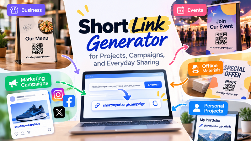
Think about the job before thinking about the link
When creating a link for a project, the first question should not be “How short can I make this?”
Ask instead:
Where will this link appear, and what is the person supposed to do with it?
A link printed on a poster has different requirements from a link sent in a private message. A campaign link has different requirements from a URL placed in a resume. A temporary event registration page has different requirements from a permanent business contact page.
The destination matters, but so does the environment around it.
Once you understand the job, choosing the right link format becomes much easier.
Small businesses have more links than they realize
A small business might not think of itself as running a “link management system”, but look at the average week and the evidence quickly appears.
There is a link to the menu. A product page. A contact form. An online catalog. A promotion. A customer feedback form. An appointment page. Perhaps a special landing page for an upcoming event.
Each one may be shared through a different channel.
A short link can make these destinations easier to communicate, especially when employees need to share them quickly with customers.
Imagine a staff member telling a customer:
“Go to our website, find the promotions section, scroll down, then…”
That is a lot of work for something that could potentially be reduced to one simple address.
The value is not really the number of characters saved. The value is removing steps between the person and the destination.
Events are a surprisingly good use case
Events create a particularly interesting link problem because information often needs to move between the physical and digital worlds.
A poster might tell people about an event. A flyer might contain registration information. A presentation might direct attendees to a feedback form. A table sign might point people toward a schedule or online registration page.
Long URLs are awkward in all of these places.
A compact link can sit neatly inside the design without turning into a giant technical-looking string. If the link has a meaningful alias, people may also find it easier to remember when they see it briefly.
For example:
short.example/register
is considerably easier to understand at a glance than a long address containing multiple folders and tracking parameters.
And when printed material is involved, simplicity matters. People may not be able to click. They may have to type the address manually or use it later after taking a photo.
That changes the design requirements completely.
Printed materials deserve more attention than they usually get
Digital links are easy to update.
Printed links are not.
Once a URL appears on thousands of flyers, packaging inserts, posters, business cards, or brochures, changing it becomes much more complicated.
This makes link planning important before the printing stage.
First, confirm the destination. Then test the short link. Then check how it looks in the actual design. Finally, test it again before the material goes into production.
A link that looks fine in a browser can look surprisingly strange when placed inside a printed layout.
There is another advantage to keeping the printed URL simple: people have a better chance of remembering it.
That matters because not everyone will scan a QR code or click a button. Some people will simply type what they see.
A short, recognizable address gives them a fighting chance.
Campaigns need structure, not just shorter URLs
Marketing campaigns can quickly turn into a pile of links.
You might have one landing page promoted through email, another placement on social media, a printed advertisement, a partner campaign, and a link used by your sales team.
If everything points to the same destination, it is tempting to create one generic short URL and use it everywhere.
Sometimes that is perfectly fine.
But when you need to understand how different placements perform, separate links can make your workflow easier to organize. Each link can have a clear purpose while directing visitors toward the appropriate destination.
For example:
short.example/summer-email
short.example/summer-poster
short.example/summer-social
The exact naming convention is up to you. What matters is being able to look at a link later and understand why it exists.
This is much more useful than generating random codes and trying to remember what each one means three months later.
A short link can become part of your campaign naming system
There is a subtle benefit to meaningful aliases: they can help people inside a team understand what a link is for.
Imagine someone sends a spreadsheet containing:
short.example/a82Kq
short.example/x91Lm
short.example/p73Rt
Nobody knows what those links represent without opening them.
Now compare that with:
short.example/sale
short.example/signup
short.example/event
The second group is immediately more readable.
This does not mean every link needs a clever name. In fact, trying too hard to make every alias “creative” can make a system harder to maintain.
Clear beats clever.
A consistent naming pattern is usually more valuable than an impressive-looking individual link.
Personal projects can benefit too
Short links are not only for marketers and businesses.
Consider a portfolio, resume, community project, online profile, personal newsletter, or side project. You may want to direct someone to a specific page without asking them to navigate through your entire website.
A compact link can make that introduction easier.
This is particularly useful when the link is being shared verbally or placed somewhere with limited space.
For example, if someone asks for your portfolio during a conversation, giving them a short address is much easier than reading a long URL containing several directories and parameters.
The same idea works for creators, freelancers, students, event organizers, and anyone who regularly shares specific pages.
Short links and QR codes can work together
Short links also have an interesting relationship with QR codes.
A QR code does not require a short URL in order to function, but a shorter destination can make the underlying setup easier to manage and communicate in some situations.
Imagine an event poster containing both a QR code and a short URL.
The QR code gives smartphone users a fast route.
The short URL gives everyone else another option.
That small piece of redundancy can be useful. If the QR code is damaged, difficult to scan, or simply ignored by someone, the visible URL remains available.
It also makes the printed material more understandable. Instead of displaying a mysterious square and expecting everyone to know what it does, you can provide a human-readable alternative.
Not every project needs a short link
This is worth saying because shortening everything is not a strategy.
Sometimes the original URL is better.
If the domain itself is an important part of your brand, displaying it may be more valuable than hiding it behind a shortened address.
If the recipient needs to inspect the URL before clicking, transparency may matter more than convenience.
And if the URL is already short and readable, shortening it might accomplish almost nothing.
For example:
example.com/contact
does not really have a problem that needs solving.
Turning an already-simple URL into another link may simply add an unnecessary redirect.
The best workflow is selective. Use short links when they solve an actual problem.
Build a small system instead of collecting random links
Once you start using short links regularly, organization becomes the difference between a useful system and a digital junk drawer.
A simple spreadsheet can be enough.
Keep columns for:
- Short URL
- Destination URL
- Purpose
- Campaign or project
- Creation date
- Where it is being used
- Notes
This takes very little effort when you have ten links.
It becomes extremely valuable when you have fifty.
You can also establish a basic naming convention. Perhaps campaign links always begin with the campaign name, while permanent business links use simple descriptive words.
There is no universally correct structure. The important thing is that someone looking at the list later can understand it without having to open every link.
Give important links a pre-launch check
Before publishing a short link, run through a simple checklist.
- Destination: Is the original page correct?
- Redirect: Does the short URL actually reach that page?
- Alias: Is the short address readable and appropriate for its context?
- Device: Does it work where your audience is likely to use it?
- Design: Does it look good in the material where it will appear?
- Longevity: Will the link still be useful for as long as the project requires?
- Tracking: If this is part of a campaign, do you have the information you need to measure its performance?
None of this needs to become a giant technical operation. The point is to catch mistakes while changing them is still easy.
What makes a short link genuinely useful?
The answer depends on the project.
For an event poster, readability might matter most.
For a marketing campaign, organization and measurement could be more important.
For a business card, memorability may be the priority.
For a personal project, simplicity might be all you need.
That is why choosing a short link generator should start with the job you are trying to accomplish rather than the number of characters you want to remove.
The tool is only one part of the process. The real value comes from how the resulting link fits into your workflow.
Make the link boring — in a good way
The best links often become almost invisible.
Someone sees the URL, understands what it is for, uses it, and moves on.
There is no confusion about what to type. No giant string taking over the page. No spreadsheet full of mysterious codes. No last-minute panic because nobody tested the link before printing 5,000 flyers.
That is the sweet spot.
A short link does not need to be clever. It needs to be useful, predictable, and easy to work with.
Whether you are preparing a campaign, organizing an event, running a small business, or simply sharing a page with someone, start with the task rather than the technology.
Then create the link around that task.
The difference sounds small, but it is what turns a collection of shortened URLs into a system that actually makes your work easier.