How to Use Short Links in Email Signatures Without Looking Spammy
Your email signature is supposed to be the quiet part of your email. Your name, job title, company, maybe a phone number, and one useful link. Done.
- Your Email Signature Doesn't Need Every Link You Own
- Why Long URLs Feel Especially Awkward in Signatures
- Should You Shorten Every Link in Your Signature?
- A Short Link Still Needs Context
- Choose a Short Link That Doesn't Look Random
- When a Free Tool Is All You Need
- Don't Turn Your Signature Into a Link Directory
- Remember That Most People Will See It on a Phone
- Five Email Signature Link Mistakes Worth Avoiding
- A Simple Formula for a Better Signature
Then someone adds a website URL that looks like it escaped from a database query.
Suddenly, the signature takes up three lines. On mobile, the URL wraps awkwardly. On top of that, a long address filled with slashes, numbers, parameters, and random-looking characters can make the whole thing feel less polished than the email itself.
That is where a short link can make sense. But there is a catch: shortening a link does not automatically make it look professional. A mysterious URL with a meaningless string of characters can create a different problem. The trick is to make the destination clear while keeping the actual link compact.
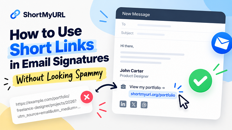
Your Email Signature Doesn't Need Every Link You Own
One of the easiest ways to make an email signature messy is to treat it like a personal sitemap.
Website. LinkedIn. Instagram. YouTube. Portfolio. Booking page. Contact form. Store. Newsletter. Then perhaps another link because, well, there was still a little space left.
Nobody needs all of that every time you send an email.
Think about what you actually want the recipient to do. If you're a freelancer, perhaps the portfolio matters most. If you're a consultant, a booking page may be more useful. If you're representing a company, the main website might be the obvious destination.
A focused signature usually feels more intentional than a collection of every profile you've ever created.
Why Long URLs Feel Especially Awkward in Signatures
A long URL isn't necessarily bad. The page can work perfectly and the address can contain perfectly legitimate information. The problem is presentation.
Email signatures have limited visual space. A long address can wrap onto another line, push other information downward, or become difficult to scan when someone is reading an email on a phone.
There is also a psychological issue. People don't read URLs character by character. They glance at them. If the address is extremely long, that quick glance becomes harder.
Compare these two approaches:
Portfolio: example.com/portfolio/freelance-designer/projects/2026?source=email
versus a concise branded-style link such as:
Portfolio: shortmyurl.org/portfolio
The second option isn't inherently more trustworthy simply because it is shorter. Its advantage is that the surrounding context makes the destination easier to understand.
That distinction matters.
Should You Shorten Every Link in Your Signature?
Nope. Shortening everything just because you can is a great way to create a different kind of clutter.
If your company website is already something simple like example.com, there may be little reason to replace it. The domain itself could be part of your brand recognition, and showing it directly tells the reader where they are going.
A short link becomes more useful when the original URL is cumbersome, contains tracking parameters, points to a deep page, or simply looks ridiculous inside a small signature.
The goal isn't to make every URL shorter. The goal is to make the signature easier to use.
A Short Link Still Needs Context
Here's where many people get it wrong.
They take a long URL, shorten it, and paste the result into their signature:
shortmyurl.org/a8X4q
Technically, job done.
Visually? Not quite.
A random-looking short link gives the recipient very little information. They may have no idea whether it leads to your portfolio, a booking page, a product, or something completely unrelated.
Instead, give the link a label.
View my portfolio → shortmyurl.org/portfolio
Book a meeting → shortmyurl.org/book
Explore our products → shortmyurl.org/products
Now the reader doesn't have to guess.
The label explains the purpose. The short URL keeps the layout compact. Both pieces work together.
Choose a Short Link That Doesn't Look Random
Not every short URL has to look like a six-character puzzle.
If you have the option to create a memorable alias, use it when the destination is important enough to deserve one. A meaningful path such as /portfolio, /book, or /demo is easier for humans to recognize than a completely random combination of letters and numbers.
This is particularly useful when somebody sees the link outside the original email. A memorable address has a better chance of being understood and remembered.
There is another benefit: it gives you a chance to catch mistakes before they reach your recipients. If the alias clearly represents the destination, you can immediately notice when something looks wrong.
When a Free Tool Is All You Need
For a basic email signature, you probably don't need an elaborate link-management setup.
If all you want is a cleaner address for your portfolio, contact page, booking form, or another destination, a link shortener free service can be enough to handle the job without adding unnecessary complexity.
The important part is choosing the destination carefully and presenting the resulting link with enough context. A shorter URL is useful because it solves a practical formatting problem; it doesn't need to become a whole marketing operation.
For people who send dozens of emails every week, that small improvement can add up. Your signature stays compact, your important link remains visible, and recipients spend less time trying to figure out what a giant URL is doing at the bottom of your message.
Don't Turn Your Signature Into a Link Directory
There is a moment when an email signature crosses the line from useful to crowded.
You can usually spot it immediately: multiple icons, several rows of social links, a banner, a disclaimer, three calls to action, and a collection of URLs that nobody asked for.
More links don't automatically mean more opportunities.
In fact, every additional link competes for attention. If everything is important, nothing really stands out.
A better approach is to decide what deserves the prime spot. One strong CTA can be more useful than seven competing destinations.
Your signature should support the conversation, not hijack it.
Remember That Most People Will See It on a Phone
A signature that looks perfect on a desktop monitor can fall apart on a 6-inch screen.
Before you settle on your final version, send yourself a test email and check it on mobile. Look at the line breaks. Check whether the link is easy to tap. Make sure the CTA and destination stay visually connected.
Also test the signature in the email clients your audience actually uses. Gmail and Outlook may render spacing, fonts, images, and links differently.
This sounds like a tiny detail until you see your carefully designed signature turn into a cramped block of text on your phone.
Mobile is not the edge case anymore. For many recipients, it is the main screen.
Five Email Signature Link Mistakes Worth Avoiding
- Using too many links. Pick the destinations that actually matter instead of publishing your entire online existence.
- Showing a mysterious short code with no explanation. A compact URL still needs a useful label.
- Using an unnecessarily complicated alias. If people have to stare at the address to understand it, you've missed an opportunity.
- Making the CTA vague. “Click here” tells people almost nothing. “View my portfolio” is much clearer.
- Skipping the mobile test. Your signature may look excellent in the editor and terrible in an actual inbox.
None of these problems require a fancy redesign. Most can be fixed by removing things, simplifying the wording, and giving the primary link a clear purpose.
A Simple Formula for a Better Signature
You don't need a complicated system.
Start with the destination. Decide what you want the recipient to visit. Then create a compact link if the original address is too long or awkward for the signature.
Next, give the link a useful label. Don't make people decode the URL themselves.
Finally, test the finished signature on both desktop and mobile.
That's it.
The best email signature links aren't necessarily the shortest ones. They're the ones that fit naturally into the message, make their destination obvious, and don't demand unnecessary attention.
Your email already has enough words. Your links don't need to add another mess.